Dark Theme Readability

Loving the ne site!

I do prefer the Dark Theme as I use it globally on my system.

MacBook Pro, macOS Monterrey 12.1

However, the text is a dark grey or bluish color, and against a dark background it is impossible to read without selecting and highlighting the text. I don’t see a way to change the text color? It should default, when against a dark background, to a white text or at least something that makes the text stand out.

Scott

This was one of the issues raised during testing and is on @LievenDV 's To Do List.

To ensure we maintained a good user experience to start with, the default was changed to Light.
Good to raise the issue. Feel free to add anymore here

We have flushed a few things out in beta testing but there will still be things that crop now and then.

Cheers

Toby
:sunglasses:

1 Like

Excellent! Thanks…I look forward to using the Dark Theme. I don’t mind the default light one, but the dark is easier on my eyes.

If this helps on mobile dark theme works like a charm, hopefully desktops will follow soon :slight_smile:

1 Like

Scott you beat me posting about this. I like white text on black/dark background but the blue text I see is nearly unreadable with a dark background.

1 Like

I was beaten to the punch as well…it was already posted in the Issues and Questions forum.

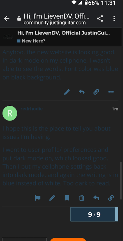
the writing is too dark for me to read. I like my cellphone in dark mode, and usually the background is dark and words are white. The background I see on your website is black, but the words are in blue.

Same issue here with Windows browser, unfortunately not readable in dark mode. Couple pics below:


1 Like

The dark themes are unusable and should not be the default. It really threw me off until I discovered how to change it.

I (TEMPORARY) SWITCHED THE “DARK MODE” TEMPLATE TO LIGHT.

Mobile Users: try logging in again, does that change things for you?
Is that better (for now?)

I just tried it and it better in light mode.

Cheers,

Keith

Works on mine and out of nowhere a phone app installed on my phone so I don’t have to use browser anymore :heart:

I’m on the app also (Android) and unfortunately the dark modes are unusable for me.

Regular dark theme:

WCAG dark theme:

Seeing as I am getting a reputation I just went on the dark side on the desktop browser version and its the same there. So back to normal Theme default. :sunglasses:

We’re going to recommend light layout and put “optimizing dark layout” on a to-do list…

2 Likes

Is the dark mode option still there, or is it taken down? I can’t find it

Not yet, we need to do more teasting and tweaking with it because it there were some issues with it.

1 Like

Hi @LievenDV looks like you marked this one up as Solved however I don’t think Windows readability issue has been solved yet so possibly needs status update to review? Unless you have it somewhere else marked up on to do list :slight_smile:

Hey,
I think this one was set “solved” because it was redundant with a similar post"
Meanwhile, It’s up in the top 3 items of to-do’s for the community though.

1 Like

Thanks that would be really great :slight_smile: appreciate the hard work behind the curtains!